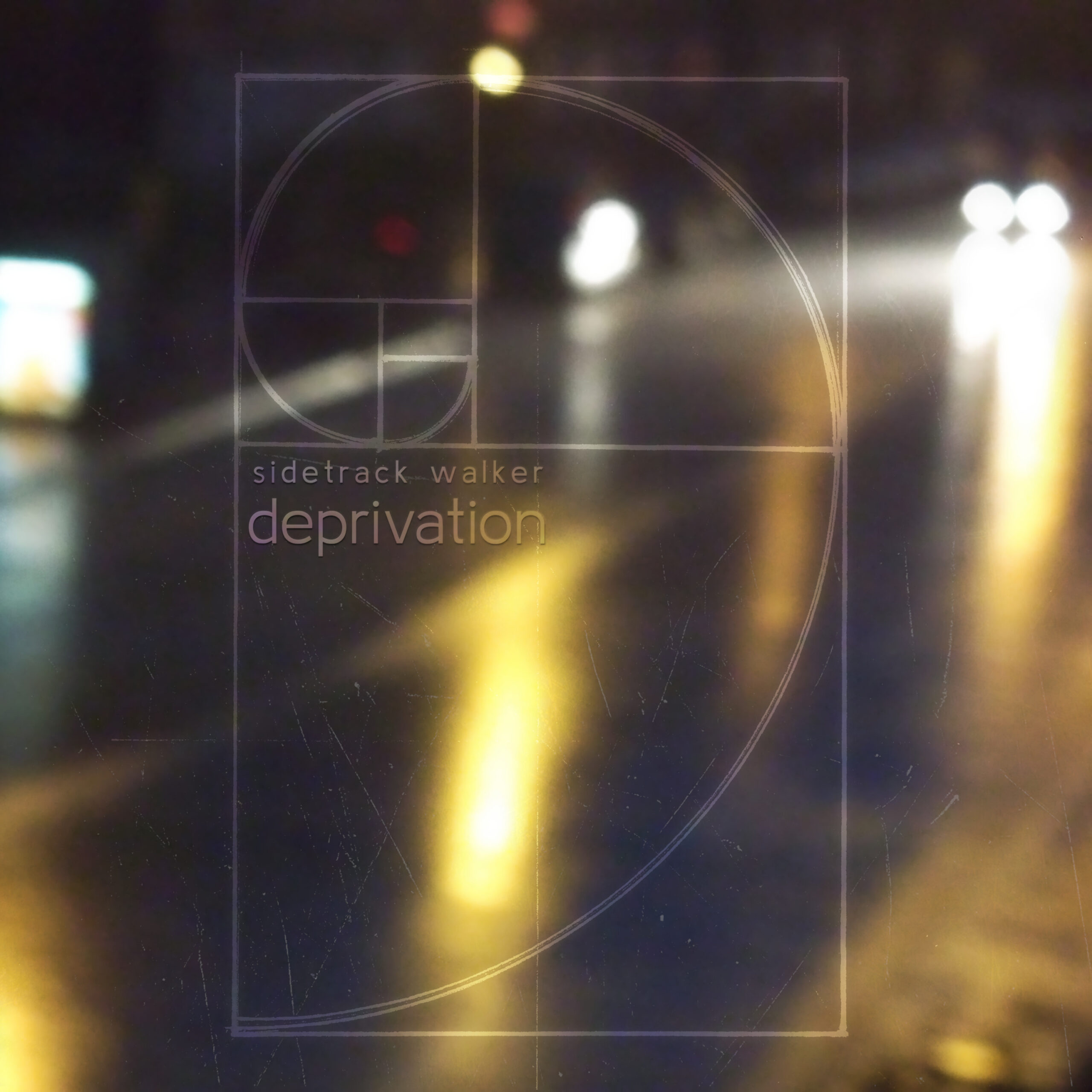
 Not long ago, a friend asked me about the “Deprivation” cover artwork. What the hell happened to the elegant style of the previous Sidetrack Walker artworks? Why the radical change?
Think back to what I told you in Bulletin #1: with “Deprivation”, I abandoned the natural-sounding approach that characterised much of my earlier output. Instead, my focus shifted towards a dirtier aesthetic highlighting the studio nature of the music and drawing heavily on urban styles from the UK. It was only natural to try and mirror that in the artwork. By the same token, the classic Sidetrack Walker logo is nowhere to be found: in its handwritten elegance, it would have been at odds with the vibe I was trying to convey.
 Back in 2014, I took a series of pictures of rainfall against an urban backdrop. I’d been meaning to use some of that material for artwork purposes ever since, and “Deprivation” finally presented the perfect opportunity. The blurry, impersonal setting of urban life complements the lyrical reference to sensory overloads as experienced by people with autism: details fade into one another in an endless, chaotic barrage of impressions; specks of light and their reflections become the ever-changing foci of attention, almost eradicating the human element from the equation. Quite fittingly, my flat at the time was taking its toll on my health for being terribly noisy, and that’s where I took those photos.
Superimposed on the urban setting is the hand-drawn sketch of a golden spiral, representing the ideal of deprivation as outlined in Bulletin 4: an inner place of harmony, offering respite from the incessant onslaught. There is a constant, unresolved tension between the two extremes, hence the stylistic contrast between photograph and sketch. Deprivation remains a vague and elusive ideal at best, never quite able to drown out the background noise.